Thursday, 31 January 2013

find - redefining maximalism

Do you like your home busy or empty? If you like your home neat and empty perhaps you are a minimalist, if you like the opposite perhaps you are a maximalist. Most of us however, fall somewhere in the middle. Although maximalism is a broad term, in design, the term describes spaces that celebrate richness, excess, luxury and fantasy.  A designer who truly mastered and glamorized this style is Kelly Wearstler. I suppose if you tell someone you're a maximalist they assume you like rooms filled with busy patterns paired with other busy finishes resulting in a cluttered space where nothing is visible because too much is there. This is not Kelly Wearstler. Wearstler uses rich, colourful and luxurious materials/finishes, and pairs these tastefully together with a whimsical flair. She also plays with scale.  Large and bold pieces of furniture and accessories add character to her spaces. Her colourful and highly imaginative style is both playful and elegant. If you're confused, see the images below, perhaps these can paint a better picture of what I mean.


Kelly Wearstler's Malibu beach house (below)


An exuberant maximalist bedroom (below)


Kelly Wearstler living room space (below)


A Kelly Wearstler vignette (below)


1  |  2  |  3  |  4

Wednesday, 30 January 2013

visit - CAPACITY INSPIRED, art show

The Gladstone Hotel Art Bar (1214 Queen Street West, Toronto) held a third year running art show from January 24-27th (2013). Many gallery parties and events were held that weekend, I visited the show with a good friend on a quiet Sunday evening.
Here is a little history: CAPACITY is an annual contemporary design exhibit featuring the multidisciplinary work of Canadian women working and/or studying in the field of design.

This years exhibit featured the work of:
Connie Chisholm | Heidi Earnshaw | Simon Ferkul | Laura Langford | Avril Loretti | Janet Macpherson | Erin McCutcheon | Laura McKibbon | Margaret Pryde | Christina Pupo | Talia Silva | Krystal Speck | Anneke Van Bommel

Here are a few snapshots of the exhibit


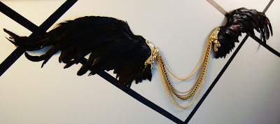
make - wing wall relief


Adding to the tape decor in my bedroom nook wall, I decided to create a wing wall relief made out of feathers. Originally, I had wanted to make it out of white feathers but when it came to purchasing my materials I opted for black iridescent feathers. I am happy with the result.

To make this relief sculpture I used:
  • black feathers
  • 11" x 17" card board (2)
  • shinny gold leather sample
  • brass coloured chains of various width
  • gold buttons
  • gold coloured metal hoops (2)
  • hot glue and gun (to glue all my materials together)

First I traced and cut-out a winged feather design onto my cardboard, I traced, and cut out the same reverse wing design onto my second cardboard. Starting from the bottom to the top, I glued feathers neatly (with hot glue) onto the cardboard. This part is tricky and a bit difficult as I had to make sure not to use too much glue, and to glue the feathers closely together.  I used a picture of a real bird wing as a reference when gluing.

Next, I cut an organic pattern out of my leather and glued this to the base of my finished wings. Using a nail and hammer, I pierced a hole through the leather and base of the wing and fastened a medium hoop through the hole.  I did the same to the second finished wing. I connected my collection of chains to the two metal hoops that I previously pierced through the base of the wings. Lastly, I decorated the leather parts with gold buttons.  I attached my wing relief sculpture to the wall using really sticky double sided tape.  Ces't tout   :)


Tuesday, 29 January 2013

visit - IDS 2013

Every year, in late January I look forward to the Interior Design Show held somewhere in downtown Toronto. The show kicks off a weekend filled with designer parties and gallery exhibitions. It's an exciting weekend for designers, artists and enthusiasts.  IDS is my favorite design show because it's the largest of it's kind and I always discover something new and inspirational.

Below are pictures of my favorite things from the show:


Student industrial design work (above). The table was designed by Christina Sicoli. I also very much enjoyed the geometric and whimsical fish bowl light fixture.


I was blown away with the IKEA booth.  Two side by side booths, showcasing a luxurious kitchen and bath were created using IKEA kitchen/vanity systems.  The large lighting installation in both booths was also created from IKEA lights.


A close-up of colored and cut branches (left) and coloured pencil crayon wall (right) installations by Black Lab Architects.

Machine-age/industrial/vintage/antique furniture and lighting creations by Metropolis Living.


large scale paper ceiling installation (left) and suspended geometric metal shark (right).


Funky industrial sconces by Eclectic Revival (above).


miscellaneous booths and furniture (above).